


Show notes are where an episode comes together. It’s where you plan the questions, keep the links you promised to mention, and work out with your guest what you’ll cover. So when the people using show.fm every week told us the page felt busy, we listened.
Today, on International Podcast Day, a calmer Show Notes page is live for hosts, along with a guest portal that looks and works the same way for the people you record with.
Why we keep coming back to the basics
When you’re building a new platform, it’s tempting to keep adding. Another panel here, another tab there. Each one makes sense on its own. Together, they can bury the thing you actually came to do.
That’s what happened to Show Notes. Your notes shared the screen with a guest panel, a separate card of access links, research in its own place and a chat that competed for attention. Everything you needed was there, but finding it in the middle of a recording took too long.
Our founding members are the reason we could see this so clearly. They use show.fm for real shows, and they can reach Nathan and me directly in our private Discord. We watch how they work, read everything they send us, and ship changes quickly so they can tell us whether we got it right. This release went through several testing rounds over two weeks before we were happy with it.
The principle we landed on is simple: when you’re preparing or recording, the page should get out of your way.
One sheet for your notes
Your notes now sit on a single sheet with two tabs: Host-only, for the prep only your team sees, and Shared, for everything your guests can read too. A line at the top of each tab tells you exactly who can read it, so you never have to guess before you type something private.
Every guest in one place
Each guest now sits in a dock beside your notes. Pick a guest, and you’ll see their brief and the notes you share with them. The brief brings together their booking answers, anything they told you when they booked, their Guest Network profile and any AI research you’ve run, in one read-only place your guests never see. If something in it belongs in your prep, add it to your Host-only notes in a click.
Each guest’s access link lives with them now too, so when a guest asks where to go just before you start, it’s right there.
A recording view for when the mic is live
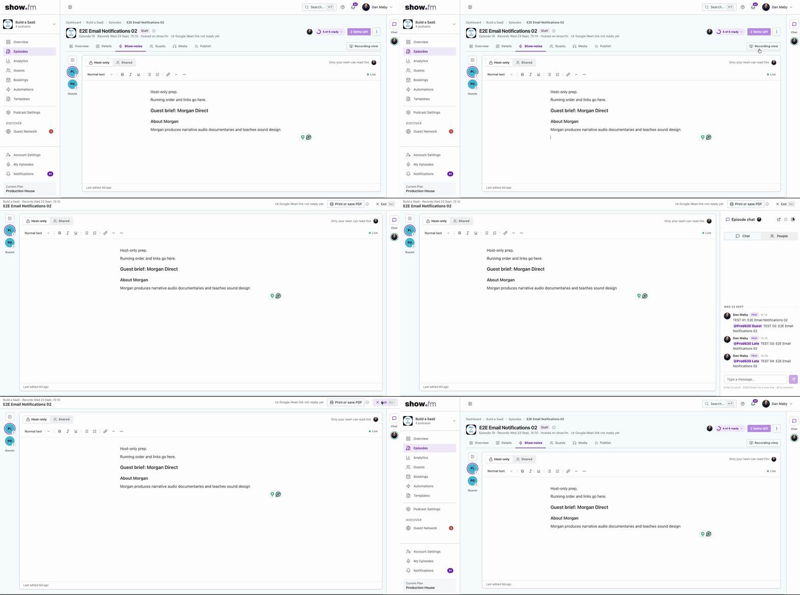
If you try one thing from this release, make it this. One click on Recording view clears the app away and leaves only what you need while you record: your guests and your Host-only notes, with the meeting link and a Join button at the top.
Why it helps:
- Fewer distractions mid-interview. Menus, tabs and the episode header slide out of view, so your eyes stay on your questions and your guest.
- Your prep comes first. Host-only notes come to the front, because that’s where your running order lives and nothing typed there reaches a guest. Shared notes are one click away.
- The meeting is always at hand. The episode’s name, when it records, and the meeting link stay in a slim bar at the top, with Copy and Join.
- Easy in, easy out. Press Esc to go back. The recording view has its own address, so a reload keeps you in it.
- Paper, if you prefer it. Print or save PDF lays out every guest’s full brief followed by your Host-only notes.
There’s more on how it works in the recording view guide.
Make room for what matters to you
Everyone works differently. Some hosts keep the chat wide open during prep; others want every pixel for their notes. So the page now bends to you:
- Drag the guests dock wider or narrower, or fold it down to a column of faces when you want the space.
- Drag the chat wider or narrower, or fold it to a slim rail that still shows unread messages and who’s online.
- show.fm remembers your layout on that device, so it’s how you left it next time.
The Show Notes guide covers the details, including the keyboard shortcuts for picking a guest.
A chat that stays out of the way
The episode chat now runs down the right edge of the window instead of crowding your notes. Messages read as one clear thread, with a divider for each day, each person’s role beside their name, and times shown in your own time zone, so you always know who said what and when. Reacting and deleting are tidier too. The messaging guide has the rest.
Your guests get the same care
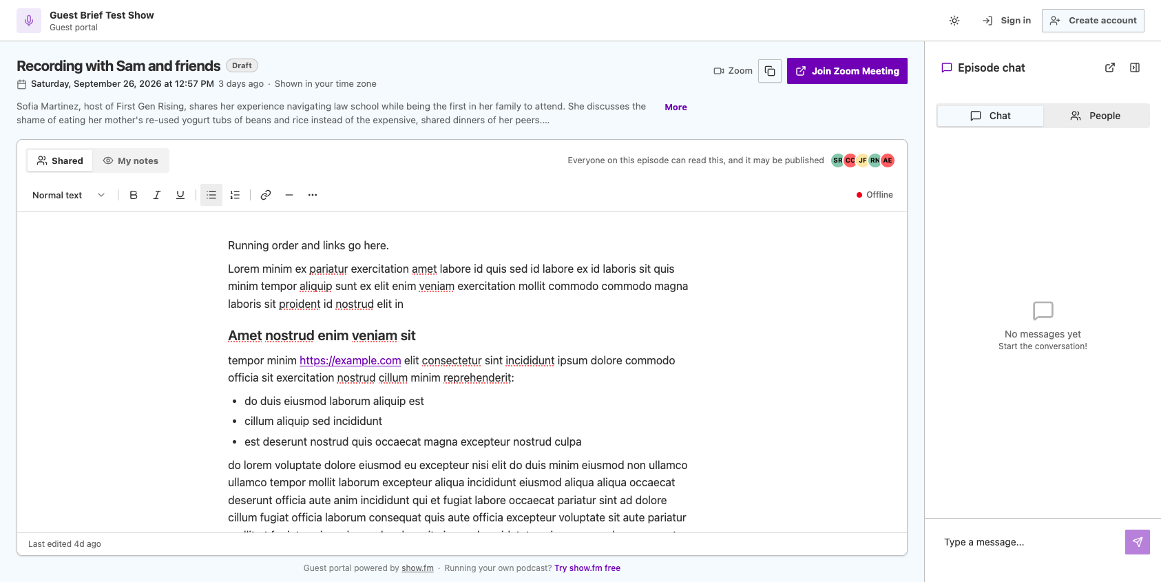
Your guests deserve the same calm. The Guest Portal now opens with the essentials: which episode it is, when you’re recording in their own time zone, and, once there’s a link, a Join button. Below that is the same notes sheet you use, with a line on each tab saying who can read it, and the same chat.
On a phone, guests switch between Shared notes, their own notes and the chat, one at a time. If you’re sending guests to the portal for the first time, this page explains it from their side.
The smaller things
A few more changes came along for the ride:
- One formatting toolbar across the editors, a card to open, copy or edit any link, and a list of Markdown shortcuts (Cmd or Ctrl and /).
- Templates now fill in the magic tag “guest names” and the “episode number” for every guest’s notes, including guests who join a booking later.
- Who’s online and the Live status stay steady; we noticed it was blinking every minute.
The full list is in the changelog.
Keep telling us
None of this is finished. The best ideas in this release came from people using show.fm for real episodes, and we want more of that.
If you’d like to see it in action and ask us anything, join show.fm Live, every Wednesday at 4 PM UK time. If you’re not using show.fm yet, you can start for free, or become a founding member and help shape what we build next.